Thanks to rapid technological advancement and an evolving consumer market, more eCommerce stores are popping up by the day. It is no surprise that many gravitate towards buying online for convenience and comfort. Hence, the eCommerce outlook is promising, with eCommerce revenue expected to reach $1.3 trillion by 2025.
However, competition is stiff as the eCommerce space expands. As an eCommerce business owner, you need to look beyond what is obvious to identify what can set you apart from the rest. Look for those deal breakers – your customers’ pain points. Knowing and resolving them is key to growing your business.
Customer Pain Points Explained
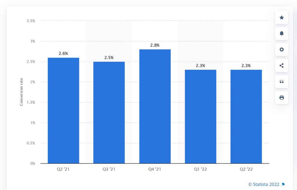
Online shopper conversion rate in the US 2021-2022 (Source: Statista)
Despite the booming eCommerce industry, conversion rates in the US are still low. Many business owners tend to focus on their business’s pain points rather than the customers. Such oversight is costly as your customers’ shopping experience becomes compromised; they take their business elsewhere.
Customer pain points are typically problem areas and issues that your customers (existing and potential) face while shopping at your store. These pain points pose a barrier to a seamless customer experience and checkout completion. The customer intends to purchase but cannot because of these pain points.
Pain points vary depending on the individual, making it difficult to pinpoint and cater to all. However, you can still uncover your customers’ pain points by putting yourself in their shoes. While knowing their pain points is the first step, resolving them and ensuring their ugly heads stay hidden is another. Here are some of the eCommerce customers’ pain points and respective solutions:
1. Sluggish Website
Would you wait for the product image and description to load for more than eight seconds? Your customers expect pages to load within two seconds! Many online stores sell similar products/services. As such, people are spoilt for choice and bounce off stores until they reach one that registers blazing speeds.
The same applies to your checkout process. Even when your buyer finds something they want, they abandon the cart immediately if the checkout process is complicated, tedious, and too long.
How to Fix
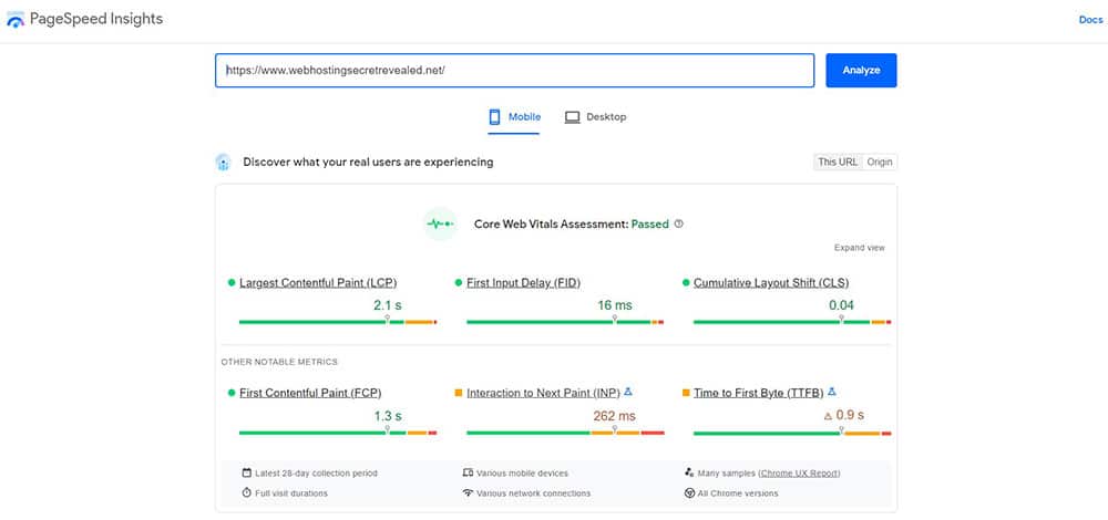
Google PageSpeed Insights offer valuable performance information. (Source: PageSpeed Insights)
Your eCommerce store must offer top-notch speeds and performance at all times. Many ways can help, and among them are:
- Web hosting – If your website is often slow, check your hosting solution. You may need to upgrade to a better package.
- Images/videos optimization – Use JPEG for images and make the video files smaller (without losing the quality).
- Minimal JavaScript usage – Remove unnecessary JavaScript files to reduce the loading time.
- Adopt caching – Caching is to store assets on the user’s browser temporarily after the first visit, so we can speed less time to load it.
- Use Content Distribution Network (CDN) – It provides faster delivery of Internet content via a server that is close to the user.
- Single-page checkouts – Customize your checkout and make it so simple that users will not think twice. Ensure no unnecessary distractions or hindrances (like filling up more information).
It’s also a good idea to perform regular load testing on your online store to ensure that your speed and performance remain uncompromised.
2. Security and Privacy
Your online store’s credibility influences a buyer’s purchase decision. A customer’s trust is hard to earn and easy to break. Once broken, it is almost impossible to recover. Hence, do not lose your customer’s trust in the first place.
Unfortunately, cybersecurity threats are on the rise. A hacked online store is disastrous as nobody will dare shop there again. After all, money transactions and personal details transact in online stores. Hence, customers are selective about where they make their purchases. They want a credible and trusted store.
How to Fix
Ensure your online store is SSL-enabled (padlock at the side of your store’s URL), a basic security necessity to encrypt the communication channel. Most web hosting packages offer a free SSL cert. Look into your web host’s security policies and practices; they should perform proactive monitoring to prevent untoward incidents.
Also, malware scanning, firewalls, and DDoS protection are just the tip of the iceberg. Use military-grade encryption to secure your customers’ details and reputable payment gateways. Assure your customers that you are taking all the measures to protect them by displaying the relevant trust seals. You should also make sure your company is compliant with all necessary data protection regulations.
2. Insufficient Payment Options
Even with an impressive product lineup, you can register low conversion rates due to limited payment options. There are so many different payment methods now. Everyone has their preferred payment mode. If you don’t offer these preferred payment methods, you might find your customers leave in droves.
Nowadays, payment is no longer dominated by Visa and Mastercard. There is PayPal, digital wallets, cryptocurrencies, and more. When you allow your shoppers to choose from a wide range of payment options, they’ll be happy to shop with you.
How to Fix
First, look at your targeted audience. If you’re catering to local and global customers, include payment options that support both. Aside from the usual credit and debit card payments, consider PayPal and e-wallets.
The idea is to integrate various local and international e-wallets and payment systems into your online store. That said, ensure that the necessary best safe practices and encryption are in place to give assurance to your customers.
Better yet is to ask your customers about their preferences. A simple survey or a poll would suffice. Collate the feedback and make the necessary changes to give your customers what they want.
3. Hidden Fees
Perhaps one of the biggest turn-offs for customers is hidden fees. In fact 49% abandon their carts due to extra costs. Customers dislike paying the shipping and other additional fees, especially those not clearly stated from the beginning. Your customers expect to know the exact amount they’re going to pay. No nasty, last-minute, escalated charges.
Shoppers have the right to know what they are paying for. If you’re not upfront with your customers, they could feel deceived and abandon their cart.
How to Fix
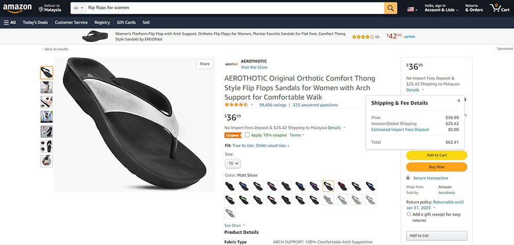
Amazon clearly states the fees so customers can make informed purchase decisions. (Source: amazon.com)
Transparency is key here. Customers dislike negative checkout surprises so ensure they never encounter them. Inform buyers of all fees upfront. Set the right expectations from the start. Aside from taxes, be clear about any extra charges (handling and others). You want to provide a seamless and happy experience for your customers so that they’ll trust you and convert.
Allow your customers to input their delivery destination from the beginning so that all fees and extras can be calculated and shown. Try looking for ways to offer your customers free shipping as this is an effective way to increase conversion rates.
Be consistent in your pricing strategy, and don’t hide any fees. You don’t want your customers to click that ‘x’ button and leave your store with a bad opinion of your brand.
4. Lackluster User Interface
Don’t judge a book by its cover. Unfortunately, many still do. It takes less than a second for a customer to form the first impression of your store. This instant can make or break the deal, so the error margin is minuscule. Dated and non-interactive interfaces are huge turn-offs. The mood is spoiled, and your customer will choose not to shop at your store anymore.
Since there are tons of similar stores online, there is no reason to put up with yours. They can shop somewhere else that brightens their mood. After all, shopping is emotionally and psychologically driven so you cannot afford to ignore this side of the equation.
How to Fix
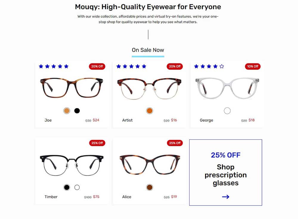
Mouqy impresses with its intuitive user interface. (Source: Mouqy)
Know your target market and their preferences. Design your website based on the ‘right’ template to appeal to your audience. Choose the relevant theme and a seamless layout with suitable color palettes that tug at your audience’s heartstrings.
It would be good to conduct a User Acceptance Test (UAT) to know what works and doesn’t. Then tweak accordingly to meet your customers’ needs and preferences. Aside from giving an impressive and attractive user interface, ensure your content is spot-on and catchy to pique their interest.
5. Poor Navigation
Giving your customers a website with poor navigation is a huge disservice. Your customers look forward to an enjoyable and smooth shopping experience with you. What do you think happens if they arrive at your store only to be stuck in an endless maze and not be able to find what they need (although you have what they want)?
They will give up and leave your store with a headache. Also, they connect your store name with a negative experience. No business owner in their right mind wants this.
How to Fix
An over-cluttered page can confuse customers and impact sales. (Source: Kinsta)
One of the main UI design tips is to keep things simple and don’t overcomplicate things. Simplify your menu items and keep your sub-menus minimal. Offer easy-to-use search functions with filter options to help narrow down customer searches. Make your pages short so that your customers don’t need to scroll down endlessly for anything.
Use simple words and keep technical jargon to a minimum. All headers and menus should be self-explanatory. Remember, your customers come from all backgrounds. Ensure they can easily understand how to use your website without any problems. Navigation must be effortless so you don’t miss out on any conversions.
6. Content Not Updated and Inaccurate
How can one make a purchase when there’s not enough relevant information? Put yourself in your customer’s shoes. You genuinely want to buy but can’t because of incorrect, irrelevant, or illogical information. Customers want to know the product, its materials, who it’s for, and its benefits.
Customers may abandon their carts because of a lack of relevant information or because the provided information is inaccurate and misleading. Remember, your shoppers need more than just a single image to make a purchase. Low-quality product information irritates your buyers.
How to Fix
Help your shoppers by making adequate and accurate information readily available. Regularly update your product descriptions to be relevant and engaging. Your customers expect top-notch images, brief yet comprehensive product descriptions, product videos, reviews from other buyers, testimonials, and social proof.
Decide what needs to be in and what doesn’t. Too much information can be overbearing, and too little is not enough. Hence, strive for that perfect balance to get the key points across. Your descriptions must be engaging and informative enough to have persuasive power over your shoppers.
Remember, your product description is a powerful tool to help build trust and credibility.
7. Inconsistencies Across Sales Channels
The various sales channels available to businesses are ever-growing. Businesses are keen to use available multi-channels to increase their reach and meet customers’ varying shopping needs. However, from the more traditional TV, billboards, and radio to the digital highway and social media, it is easy to have inconsistencies across different channels.
As a result, you end up with a pool of confused and frustrated buyers. Imagine seeing an ad about a product you have been anticipating for a long time on a billboard, only to face a ‘not available’ message when you click the Facebook ad. This simple oversight is enough to kill conversion rates.
How to Fix
Consistency is essential to a successful business. Hence, all your advertising and sales channels must regularly be updated to stay relevant. Your shoppers expect a uniform shopping experience across all your channels. Look into deploying automation throughout your sales channels so that everything is consistent across the board and at the same time.
The goal is to streamline your sales channels and make them as low-maintenance as possible. Not only do you save time, but your customers are afforded accurate information at all times; this leads to higher credibility for your business.
8. Wrong Order Received
Imagine finally making a payment for something that you want. You wait with anticipation until your product arrives, only to realize that it isn’t what you ordered. Your balloon deflates. The same applies to your customers each time they receive a wrong order. You leave them feeling frustrated and dissatisfied with your brand and service.
Not only does this increase the number of returns, but also the customer has nothing to use. Do you think that your shoppers will willingly buy from you again? The answer is a resounding ‘No’. The shopping experience is ruined by all the complaining, returning, and replacement hassles.
How to Fix
You have to get it right from the get-go. You may be fast at shipping your orders, but if they are incorrect, your efforts will be in vain. Hence, invest in a robust order management system to ensure all order confirmations and delivery are spot-on. Ensure proper communication to keep your customers informed throughout the delivery process.
That said, if an incorrect item is shipped, you cannot deflect responsibility. Instead, empathize and initiate the return as soon as you can while assuring that rectification or a refund is on its way. Make it simple for your customers to make returns.
Wrapping Up
As an eCommerce business owner, there’s no magical pain relief patch to remove your customers’ pain points. Each pain point comes with challenges that you invest time and effort to resolve. You must identify your customers’ pain points and fix them to take your store to the next level.
Always put yourself in your customers’ shoes and see things from their perspective. Then take the necessary steps to fix the problems before they worsen. These fixes are not a one-time thing. Regularly monitor and be on your toes to reduce cart abandonment.


